After being hypnotized by a few too many Dribbble brand packages I decided to jump in and create a delicious redesign of my own.
David and I chose Cinnabon as our target for the mock redesign and delivered a comprehensive, ready to use, branding package that if implemented would drive more sales by increasing recognizability and brand presence.
Timeframe
3 weeks
Disciplines
Brand design Illustration Typography Motion
Table of contents
01. Research
02. Discovery
03. Redesign
04. Marketing
05. Epilogue
Research
Rolling out the dough
Cinnabon's signature look
I conducted a comprehensive brand analysis to understand the brand from top to bottom, building a strong foundation for the redesign.
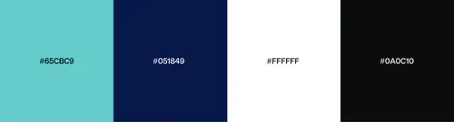
Fig 1.0 — Visual identity
Splitting the brand into boxes
I analyzed Cinnabon's web and social media presence to get a feeling for their identity, then distilled their brand tenets into keywords.
This process allowed us to focus on the core aspects that define the brand.
Based on copy:
Magical, irresistible, luscious, iconic, quality.
Based on visuals:
Fragile, quality, iconic, old timey, whimsical.
What could it be?
Best quality, minimal, vibrant, whimsical, delicious, irresistible.
Grabbing keywords helped a ton through the whole process to visualize avenues we could go down
Cinnabon is a gourmet specialty bakery founded by a father-son duo with the mission to create the world's greatest cinnamon roll from scratch.
“Our mission is to spread warmth — not only in our Bakeries, but also in our community”.
Value proposition of superior quality, freshness, and taste.
Target market: Caucasian females age 30-35. They are enticed by taste, freshness, and smell, and may purchase on impulse or craving.
Discovery
Scouting out an angle
Choosing our own advenure
Our research showed that Cinnabon's value proposition was the experience and nostalgic story, so we leaned heavily into the way people feel when eating a Cinnabon.
We imagining directions we could go in...
Trashin' & treasurin'
To establish a precedent for success, we executed competitive analysis, discovering where companies have failed and succeeded in the industry.
Through this process, we observed that removing too many elements from a brand's identity renders it unrecognizable, while retaining too many elements leads to negligible change.
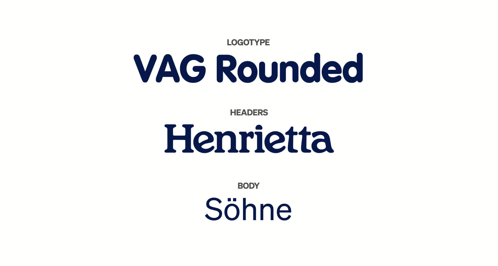
Ultimately, we opted to remove the current typefaces to craft a new story, while keeping the signature colorway.
These gotta go
I like these
We can improve this
Sketchbook time!
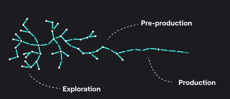
By utilizing rapid ideation and SCAMPER brainstorming methods, we drew a ton of iterations to give ourselves lots of options. My ideation process orbits around the concept of starting extremely wide and narrowing in. When performing a breadth search I let my inspiration wander, flowing from sketch to sketch, and never pick up the eraser
Fig 2.0 — Design is a search algorithm. Restructured from Jonas Tyroller
Fig 2.1 — Logomark sketches
Redesign
Welcome to the new Cinnabon
Fig 3.0 — Our magnum opus
Fig 3.1 — Logomarks
The rhyme & reason behind the tasty result
New themes
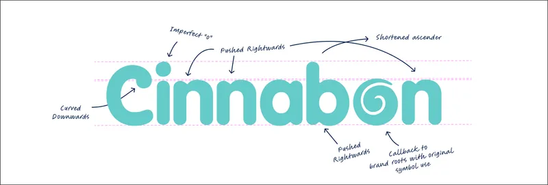
Use of a squishy, indulgent and whimsy wordmark gives off friendly and sweet vibes. The goal was to create a logo that mirrors the irresistible tastiness of the delicious product.
Vintage elements
The cinnamon swirl icon is a callback to the old-school logo from 1985. Cinnabon highly values community, warmth and family values. By referencing the brand's roots, Cinnabon accentuates and embodies their history.
Imperfection
A key focus for the design was creating an imperfect logo to match the cinnamon buns and the playful tone of the brand (fig 3.4). This involved tinkering with the typeface in illustrator to imperfect perfection.
Fig 3.4 — Squishification
Fig 3.5 — Mockups
Marketing
Transforming visuals into sales
Fig 4.1 — Cinnabon advertisement
Fig 4.2 — BTS
Fig 4.3 — City sketches
Fig 4.4 — Cinnacity, across three IG posts
By designing a top-down tasty city, I display the world entered when buying a Cinnabon,
Refreshing what's stale — the reason for the remake
If the redesign were to become adopted by Cinnabon it would be a great marketing opportunity since the last brand update was in 2016 and the logo is outdated. Without a redesign the brand will likely lose customers to competitors with stronger presences and aggressive marketing. Our redesign keeps Cinnabon competitive in modern times, with a strong value proposition, while building on core values.
If implemented, it would be key to gauge user feedback on socials and measure what they like and dislike, especially within our target market. It would also be crucial to measure growth and engagement to see which channels are effective, and focus marketing efforts effectively.
Takeaways
A sturdy backbone
When designing materials for the brand I would often exhaust my mind thinking through Cinnabons personality and target market. The way I wanted people to feel when looking at my designs led my decisions. Without a strong idea of the brand and its goals I could never have put myself in another's shoes.
No stone left unturned
Giving our right brains the freedom to wander led us down paths that would never be apparent when we started the project. Don’t be afraid to take a shot in the dark or experiment. It’s how the most ingenuities ideas form.
Show me, I'm not listening
The common “show, don’t tell” storytelling principle holds a ton of merit in brand design. During competition analysis I noted that great brands will look to match the product. Think McDonald's and simplicity, IHOP and friendly, Cinnabon and alluring indulgence. Never tell your story. Show and wow.


%201.jpg)
%201.jpg)
%201.jpg)


